20 Special Educational Needs School websites showcase students and learning and highlight principles and culture of the school.
Thorough research is carried out to determine features and functions available, costs and benefits and types of website design that would suit the school.
Having up to date information about the the industry and customer’s needs and expectation and will be key to the success of the project. Below is a sample of 20 Special Educational Needs Websites containing different, and similar, design features for our next project.
1.The Wolf School
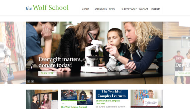
This WordPress website is simple and clear making good use of images with call to action buttons on the slider taking visitors deeper into the website.
This school website contains an active blog with their Facebook page feed inviting visitors to join them on Facebook. The dropdown menus make navigation easy to find your way around. The homepage displays the mission statement with transparent blocks leading deeper into the website. They offer Newsletter Subscription, blog, videos and testimonials on the homepage making the site very ‘active’ and current. Facebook, Twitter, Instagram and YouTube platforms used for marketing this school.
2.The Children's Institute
The Children’s Institute website has been designed to inform and communicate with current lists of events and interesting site short cuts on the home page. The video is immediately available for visitors and gives an instant insight into this organisation.
This school has their own You Tube channel, Facebook page and Twitter feed. The site contains a full page calendar of events, list of teacher by name linking to teachers own page, job vacancy page, lots of fund raising and donations pages with private members area for documents and conversations.
3. Swiss Cottage School
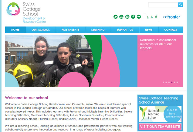
Soft pastel colour’s create the desired impact of feeling ‘welcoming’ and organisation that’s caring. The well designed slider contains testimonials and principles of the school alongside nice images.
The buttons for visually impaired are prominent at the top allowing visitors to increase/decrease the size of the text. Social Media links icons are prominent at the top and bottom of the page. Overview of the organisation and vision on the front page with a video tour of the school all make for a positive and informative first impressions. This boxed design is simple yet effective.
4. Strathmore
Branded primary colour’s throughout the website with good use of images. Block categories on the homepage for simple navigation. The translation feature accommodates many languages.
Although this school website is still under construction it delivers a “good website experience” with lots of useful content including calendar, blog, useful links, pdf’s with search facility.
5. St Elizabeths
Boxed layout with clearly defined link boxes taking visitors deeper into the website. The front page offers 2 case studies and the organisation’s mission statement with news and stories on the homepage. These features give you a sense of the school very quickly.
The logo appears as background image on the page and the overall look and feel is very nice. Social Media prominent on the page. Neat and compact with accreditation and partners logos on homepage. Mega menu used to break up the drop down into categories. Use of 2 sidebars keeps the website compact and full of information.
6. The Scheiling School
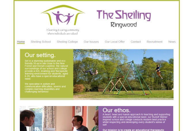
Modern with good use of soft colour’s focus on projecting a soft and caring image using a promotional video and images of happy children having fun in rural surroundings.
Good example of ‘less is more’ and simplicity reigns. Containing blog feed and social media you get a sense that the web designer has met the brief. School uses Twitter and Facebook for additional marketing.
7. Royal School for the Blind
Modern branding with eye catching logo, bold font with large fading slider, clearly defined full length sections make this home page stand out. The slider contains braille with two cool features to turn the screen black and increase the font size.
Good to see the Head Teacher on the homepage with a quote. Good use of the parallax effect using image of the pupils with the Schools ‘Vision’ stated on the homepage. Social Media feeds and blog on footer with contact form prominent. Good use of lots of great images.
8. RNBI College
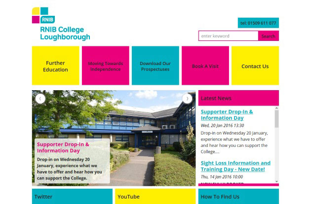
Striking colour’s immediately excite the eyes drawing you into this boxed grid design with clearly defined features and categories of the website. Blog feed and slider rather then one big slider gives visitors more information.
They have their own YouTube channel fed on homepage with map location. The additional scroller displays accreditation’s and awards highlighting quality and credibility. Clearly defined areas giving a good User Experience. Solid colour of sidebar and footer with no drop down menus.
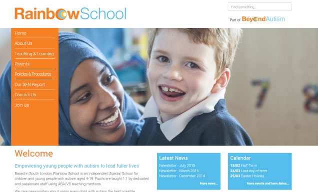
9. Rainbow School
Bold logo with full page layout with full width slider image. Vertical menu is unique, clear and concise.
Simple and effective website. The homepage consists of everything you need to know about the Rainbow School, current news, calendar of events and a quote that school embraces. Photos of the team very welcoming. Image placeholders good design and the pdf’s open embedded in the web page.
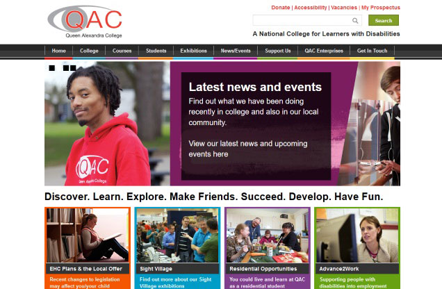
10. Queen Alexander College
There is a lot of content in this website but it’s been designed to not feel ‘overwhelming’ by being compact and easy to navigate. Menu and sidebars are colour coded. Strapline, sub menu and search facility.
The slider contains nice images with links deeper into the site and under the slider there are lots of verbs highlighting the emphasis of the school. Site contains QR code, testimonials from students and college has a ‘mission statement’ page.
11. The Priory
Sub menu and main menu separates the content about the organisation and the services they offer with breadcrumbs showing the path taken on the website. Video on the homepage is very informative and gives a good indication of what this organisation does. The slider fades with useful transparent text overlay.
Horizontal drop down menu. 6 distinct text boxes to find your way around makes navigation easy. Homepage includes blog feed with a request for feedback and sitemap. Feedback should be offline not on social media, so if you encourage feedback on the website then it will hopefully stay there. Good use of social media including Google+. Accessibility page.
12. May School
The school website border of colour nice additional design feature with prominent contact telephone on button background. Verbs used on each slide represents the schools philosophy of teaching. Video on homepage includes testimonials from parents.
Simple yet effective website, good layout. Newsletter signup feature to gain contact details of prospective parents. Nice graphic icons. photo & video gallery’s.
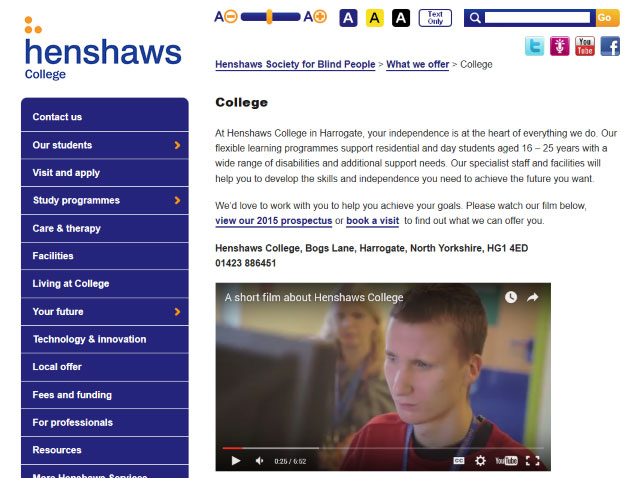
13. Henshaws
Left side menu in bold orange and blue branding. Advanced visual impairment feature to change backgrounds to black or yellow and increase/decrease text size easily and also branded. Social media links prominent. Breadcrumbs.
Short but effective strapline of what they do top of homepage followed by a small but nicely designed slider. The different categories are displayed in boxes containing nice photos. Call to action buttons include: Donate, Subscribe, Download. Twitter feed on home page and accreditation. Blog displayed nicely and Leadership page has images of the Leadership team.
14. Grove School
Having a secondary menu and main menu allows you to separate the important links from general information as used here. The sliders are informative and clear with call to action links embedded.
The School is obviously busy as the calendar is on the homepage with call to action links to admissions and school philosophy. About the School is right in the center of the homepage with news feed at the side. Photo gallery. Private login area for staff.
15. Easter Seals
Bold font with mega menu that includes photos and buttons. Site contains breadcrumbs and a private area.
Social Media links prominent and on all pages. Nice happy images, blog feed and newsletter signups. Donate takes you through to www.convio.com
16. Daldorch House School
This boxed layout draws you into the page straight to that smile ‘A picture is worth a thousand words’ the bright blue is the perfect backdrop to that image.
This is a simple template but it works extremely well with photos of the children. Two menus, search facility, breadcrumbs, print facility, date and map. This is very much an ‘information’ website clear and concise.
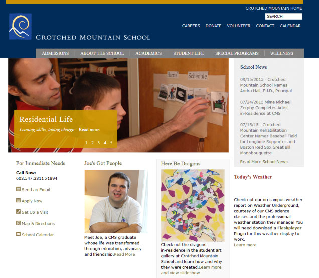
17. Crotched Mountain School
This functional website has some good features. The slider is small, subtle yet effective with links deeper into the website. It looks professional and academic with news feed on the homepage and useful call to action prominent i.e. apply now, send email, set up a visit.
The main menus are useful in giving visitors the right information – Admissions – About the School – Student Life – Wellness
List of staff names with no images as some teachers prefer not to display there photos.
18. Camphill Special School
Bright and inviting. I love pink! “The color pink is the color of universal love of oneself and of others. Pink represents friendship, affection, harmony, inner peace, and approachability” so it’s a good colour for Charities and organisations that are required to care for others. I am a fan of transparency over images and this highlights why. The whole image is visible but the mission statement and call to action is equally visible giving this page style and functionality.
This is the big, bold full width page design with full width sections containing images, maps and more. The call to action ‘Enroll your child’ is bright and bold as is the Donate button. This WordPress website makes a statement. I love the event styling. The two menus give visitors more visible options. The site displays 2 sidebars with Join us on every page.
19. Bedales School
Modern site design with soft colour pallet, nice background with beautiful professional slider images gives this website a touch of quality. Headmaster appears on the homepage as is quotes from ISI report and Tweets. The school has a link to their approach to teaching, videos, events and calender, another slider, student life and latest photos. Boom. They have included everything on the homepage in an ordered fashion.
Delving deeper into the site does not disappoint. The little features such as the search, calendar and share buttons are discrete but making it easy for the visitor. The full page calendar is modern and very useful with the added facility to print. Headmaster has his own blog, impressed.
20. Abingdon House School
Big and bold website full width design (boxed or full width is a personal preference although sites now are erring on full width) The logo is big and images are big and those smiles jump off the page. strapline under the Logo. Good use of quotes from ISI on slider as endorsements prominent.
The four boxes below the slider take the visitor to other parts of the website and one of them will display the school video. The actual content is over layered over the slider in transparent text boxes. The typography and styling of this website is very good. Making good use of the blog.
Summary of School Website Design Features
Full width or boxed layout will be due to software or personal preference but it also depends on volume of content. Good use of colour (especially pinks) throughout the sites gives a sense of fun, caring and professionalism as does images, videos, quotes and testimonials from students, teachers and parents. Standard no thrills font.
Additional features available: full page calender’s, blog posts, translator, text size adjuster for visually impaired, search facility, breadcrumbs, private login for teachers, call to action buttons, maps, forms, subscribe to newsletter, social media feeds, external payment facility for donations, scroller to display partner logos, embedded pdf’s, feedback forms, video and photo galleries.
The 3 second rule states we have 3 seconds to engage our visitor before they are gone, forever. With that in mind Bedales School shows just how to cram as much onto the homepage as possible to summarize the organisation in a neat and tidy fashion.
Having the tools and knowledge at our disposal we can now create a master plan of action for our Special Educational Needs Website redesign project. Contact us for a quote today.